Ray Of Hope
Sharpening Communication

Communicating through a Visual Language
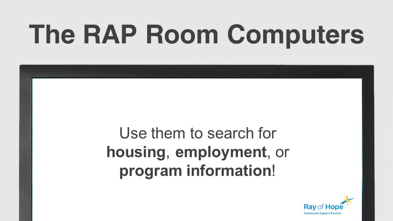
Ray of Hope is a community center that has been providing care and hope for those struggling with crime, addiction, or homelessness in Waterloo Region since 1967. Since volunteering with Ray of Hope in 2017, the community center has grown through the donations and work put in by the staff, volunteers, and the community who support it. Recently, a new flat-screen TV was added to allow the organization to make its programs and services more widely known to the 200+ people who visit on a daily basis.
As part of the Community Growth Program, ongoing graphic design services have been volunteered to make visual communication as clear and easy-to-understand as possible.
Role
Graphic Design
Simplicity and structure
Creating a visual language
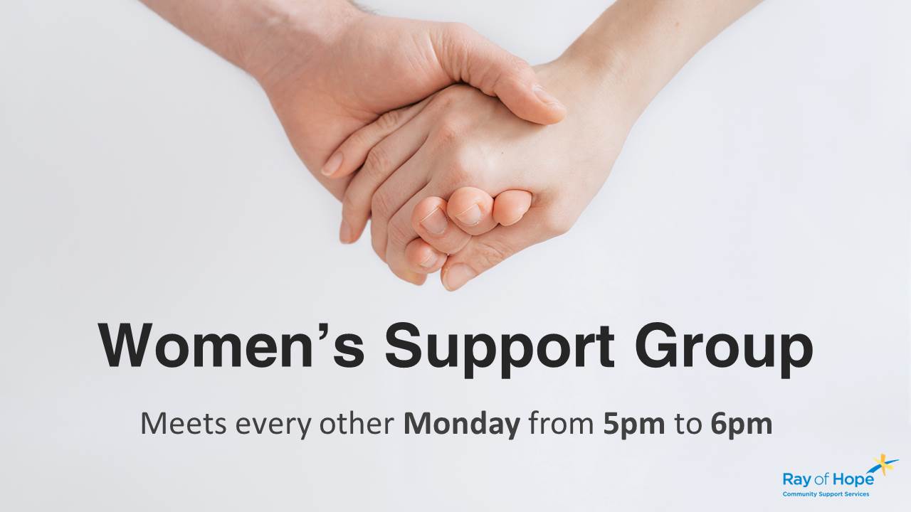
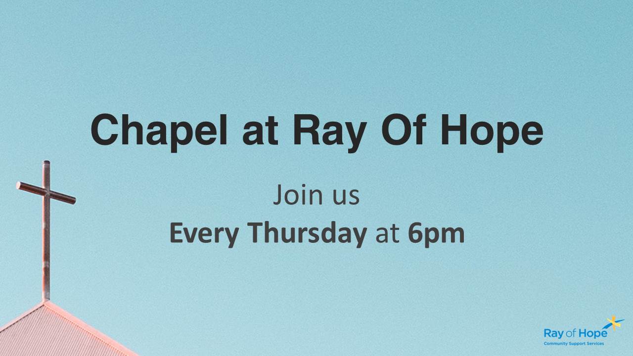
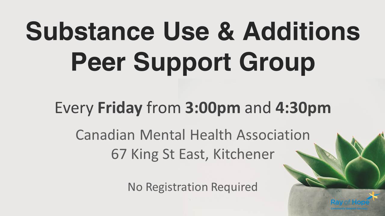
The information on the slides had to be read, digested, and understood as quickly as possible, by many people from different walks of life. A set of visual guidelines was created that clearly identified headlines, dates, and times, while utilizing a reference image if possible.


Consistency is key
Following the guidelines
Following the guidelines for the visual language is important. Once someone understands the visual structure of one slide, it makes reading, digesting, and understanding the information on all the slides that follow much easier.


Giving back
The Community Growth Program
Each year, we give back to the community by donating creative services to help support local events, initiatives, and charities through the Community Growth Program. If you believe I’d be able to help bring more attention to your cause, or reach your community goals, then let’s talk.


