Author: admin
Simplicity and structure
Creating a visual language
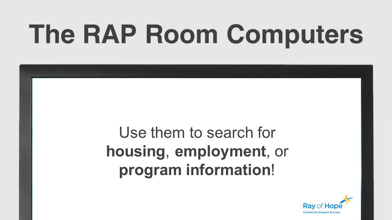
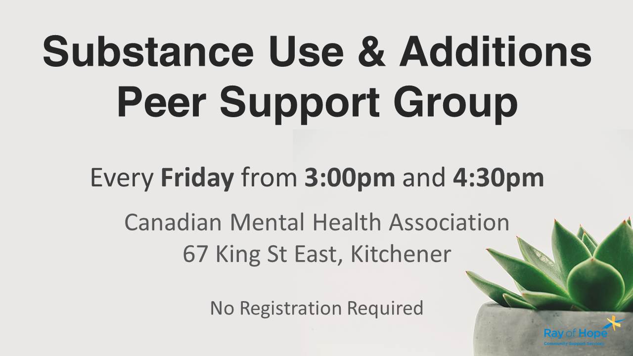
The information on the slides had to be read, digested, and understood as quickly as possible, by many people from different walks of life. A set of visual guidelines was created that clearly identified headlines, dates, and times, while utilizing a reference image if possible.


Consistency is key
Following the guidelines
Following the guidelines for the visual language is important. Once someone understands the visual structure of one slide, it makes reading, digesting, and understanding the information on all the slides that follow much easier.


Giving back
The Community Growth Program
Each year, we give back to the community by donating creative services to help support local events, initiatives, and charities through the Community Growth Program. If you believe I’d be able to help bring more attention to your cause, or reach your community goals, then let’s talk.
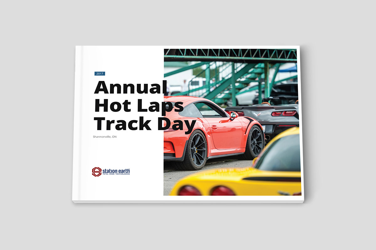
First impressions
They’re pretty important
Here’s the cover for the 22 Million Dollar presentation. It’s simple, clean, and communicates our value relative to the clients key pain-point. (Sensitive information has been blurred out.)
Six key steps
Creating a sales presentation
From the moment the opportunity came up, to the scheduled presentation date, we only had five days to get everything done. We worked through a six step process to correctly identify the opportunity and create the marketing materials to support a professional presentation.
Discovery: What is the opportunity? What are the clients goals? What are their pain points?
Strategy: What is the solution to achieve the clients goals? How can we implement it?
Copywriting: How do we articulate our solution and value in the way that the client needs to hear it?
Design: How can can we visually communicate our solution, establish our brand, and reinforce our value?
Finalize: Make any last-minute changes, decide on printing specifics (size, weight, feel, etc..).
Deliver: Print the final documents, ensure final quality, and get them in the hands of the client.
Finding the right words
Communication value
Copywriting and imagery work together to create a cohesive narrative for the presentation. We utilize images to help establish the initial ideas a client will get when looking at a page, then we craft custom messaging to communicate to the client with the words that will most effectively get our ideas across.


Your next opportunity
What’s it worth?
The key to closing a deal is effectively communicating your value, and creating a great client experience. That starts with the first piece of marketing material your clients see. If you’re looking at a new opportunity for your business, or don’t feel your current marketing materials effectively communicate your value and your brand, then let’s talk.
Focused and authentic
The new wordmark
Since A Touch Of Class specializes in high-end, architecturally inspired interior renovations, we created a wordmark that incorporated the clean-lines of modern architectural trends and the subtle details that are found within.
Familiar but new
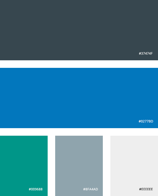
The color palette
The new color palette was designed to be familiar to the architectural client but also include a splash of color to stand out and show some personality.
Reading attitude
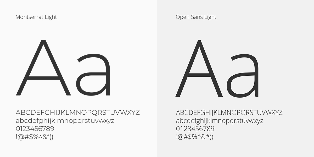
Choosing typefaces
A clean and pronounced typeface brings all the headlines forward and continues the architectural theme. An easy-to-read typeface for everything else rounds out the reading experience.
Do work that matters
For people who care
The first step to building a brand is a company Deep Dive. During this process we helped Rob identify the clients that he enjoyed working with and who also valued his skills the most. We then re-positioned his service offering and brand to speak to those clients.

Ready for the future
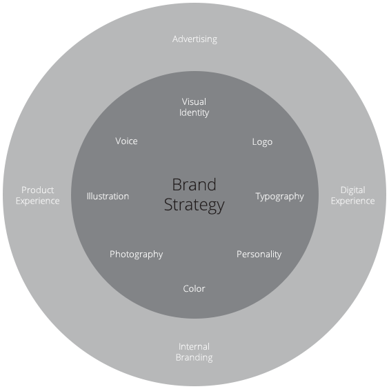
The Brand Strategy
In addition to the visual identity of the brand the following components were completed as part of the Brand Strategy. Together they serve as the foundation for creating consistent, authentic messaging:
Ideal Client Profiles,
Purpose, Vision, Core Values & Mission Statement,
Personality & Voice,
Value Proposition, Tagline & Messaging Pillars,
Comprehensive Brand Guidelines Document.
Step inside
A store in your screen
With over 300 products in the store it’s important that customers can find what they’re looking for easily. We made the homepage as helpful as possible with a prominent search bar and visual categories.

Lending a hand
On those hard names
We used predictive search to show customers the products we thought they were searching for, as they were typing – making it easier to find those hard-to-pronounce products.

What’s in stock?
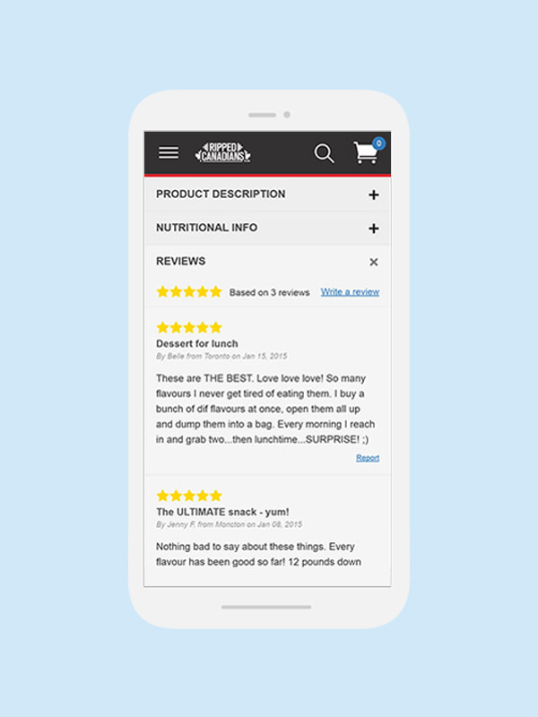
Scrolling through the aisles
Browsing through products online can be an information overload sometimes. Clear filtering tools, and clean product tiles make searching through the store easy on any screen size.

Perfect product pages
Quick-and-easy add-to-cart
Product pages are kept clean with expanding sections containing all of the information a customer would need. Instead of traditional drop-down selectors, we show all of the possible options available so customers can see everything at once, making size and flavour selection super simple on-the-go.

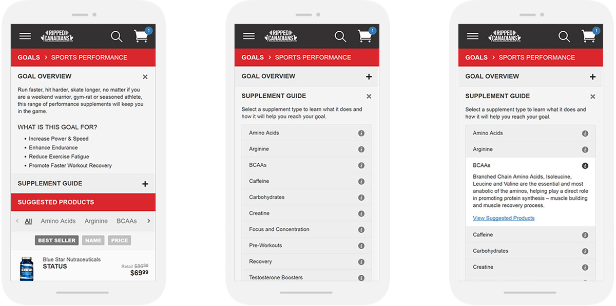
Goals on-the-go
Trying something new
In addition to product discovery features like categories, brands, and collections, the shop also lets customers search via their health goals. Educational supplement information and product recommendations create a unique way to discover new types of products.
Finishing strong
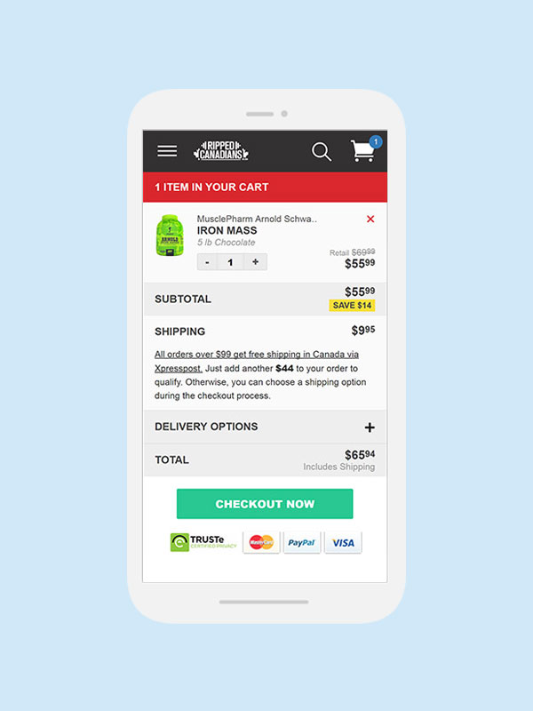
A clean checkout
The mobile checkout process can be quite messy, with tons of information confusing customers. We stripped away all the unnecessary stuff to keep the checkout process simple and smooth without loosing any functionality.

Focusing on fun
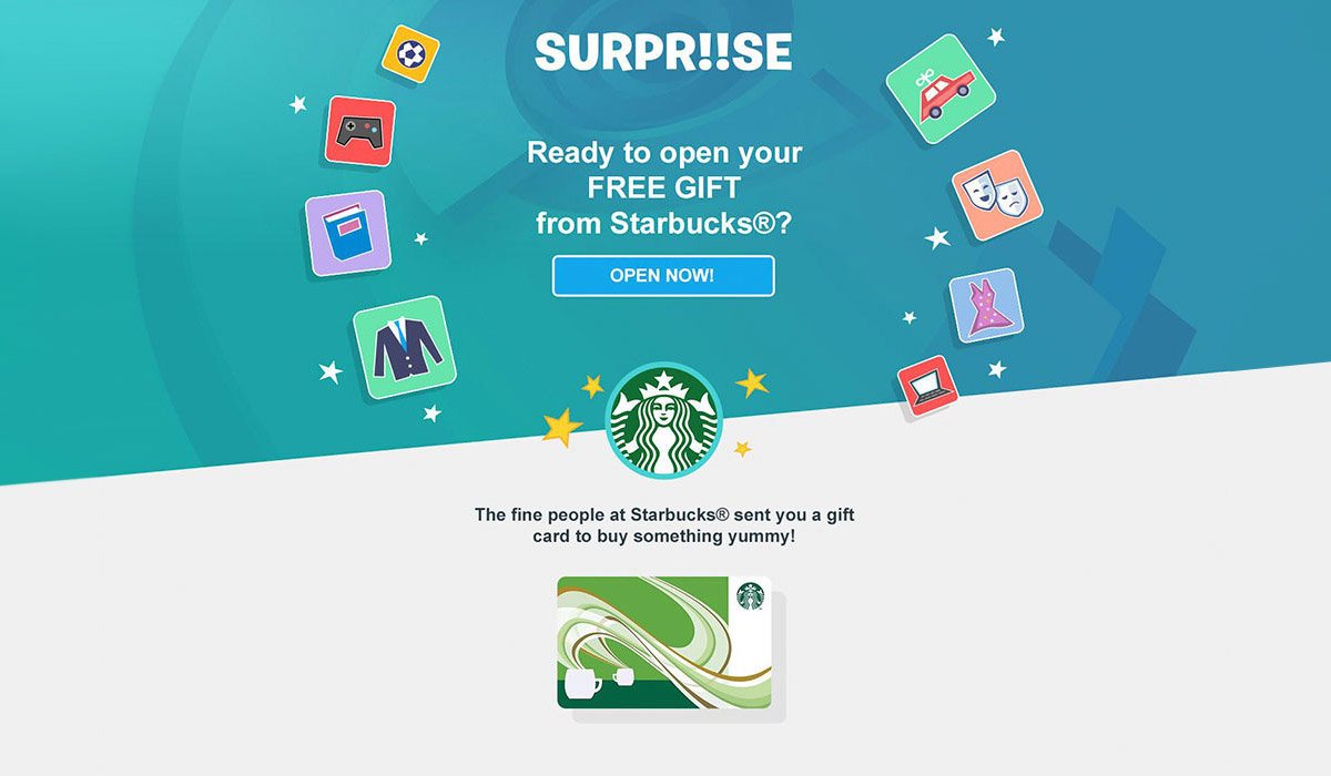
Different from the start
The Surpriise app’s design team had a very colorful and interactive vision that permeated ever aspect of the user experience. The homepage had animated tiles that were built to respond to movement on the page.

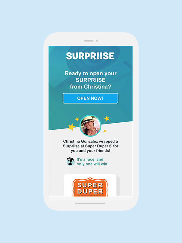
It’s in the details
User touch points
Custom assets were built to maintain brand consistency across every user touch-point, like email.

Flexible design
Flexible development
Gifts can be given from friends, companies, or brands, to one person or many, with games attached, time limits, or competitions – there are tons of options. Assets had to be built to support a ton of flexibility and look great while doing it.

Play hard
Work hard
Building a business or an application is a lot of work, and its hard to do it all sometimes. There are lots of benefits to sourcing your development projects out to a highly skilled team, like the Surpriise app did:
you don’t have to hire developers internally
you don’t have to manage developers directly
you get to focus on the design of your product and its assets
you get your project built faster by leveraging additional skilled resources
Jumping right in
Showing off the features
The CVMA’s website is a primary source of information for the public and policy makers. They had a ton of content on it – so we organized it, made it beautiful, and easy to navigate.

Easy on the eyes
Content is well structured and balanced with white-space to make it easy on the eyes – and easy to read.
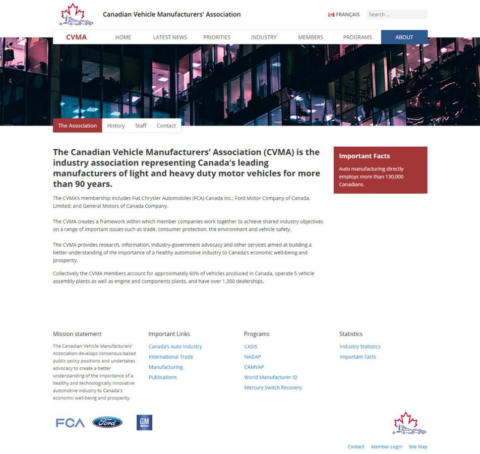
Speaking your language
We needed to support English and French as Canada’s official languages, so the website is fully bi-lingual.

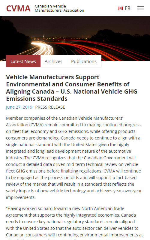
Making a statement
Or posting a press release
Press Releases, Statements, and Publications draw a lot of attention initially, but they also need to be archived for quick reference in the future.

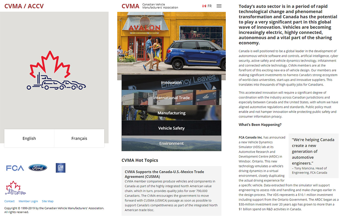
Familiar faces
Meeting the members
Each of the major automotive manufacturers’ had their own members page with more information about their operations and impact in Canada.

On the open road
Making it mobile friendly
The CVMA’s website is fully responsive – it beautifully adapts to screens of all shapes and sizes.

How does it stack up?
Looking at the numbers
The work of re-organizing the website and putting it in a responsive, Search-Engine-friendly design had a solid return:
55% increase is monthly traffic
160% increase in organic traffic
120% increase in mobile traffic